Over the past few months I have argued that AI makes analysts dramatically faster while their organisations improve only marginally. The bottleneck has always sat inside the organisation around them. That raises a harder question. If faster analysts are not enough, then what should we actually be looking at?
This piece is my attempt at an answer, and it starts somewhere unglamorous: measurement. In my experience, most analytics functions struggle to answer a simple question, how would you know if your organisation was actually getting better? Better here has a specific meaning. Fewer repeated requests than a year ago. Faster decisions. More questions the business answers on its own, without raising a ticket.
What your KPIs can and cannot see
The management cliché says you can only improve what you measure. Like most clichés it is half true, and the half that matters here is the converse: what you measure is what you will get more of.
Which would be fine if analytics teams chose their measures deliberately, but, unfortunately, most do not. Plenty of functions have no formal KPI framework at all, and performance still gets judged; it just gets judged through whatever is visible, and what is visible is motion. Metrics like requests closed, dashboards shipped, etc. which measure how fast the team turned something around last week. In the absence of deliberate metrics, the organisation defaults to measuring busyness, and the team, quite rationally, optimises for looking busy.
AI has made this failure mode urgent rather than merely chronic. Motion metrics are climbing everywhere. Teams are visibly busier. The systems around them are not visibly better.
Systems thinking has a name for this trap: every component of a system can look healthy in isolation while the system as a whole fails, because nobody is measuring the connections between components. Query volume high, utilisation full, delivery fast. Every local number says the team is performing. None of them says whether a decision got made, and none of them says whether making the next decision will be any easier.
So the first job is a classification exercise. Metrics are not all measuring the same kind of thing, and they sort cleanly into four levels.
The four levels
Every level depends on the one below it: activity creates outputs, outputs enable outcomes, and outcomes reveal capability. The four levels build on each other, each one enabling the next. The villain here is a scorecard stuck at Level 1 and 2, never advancing further.
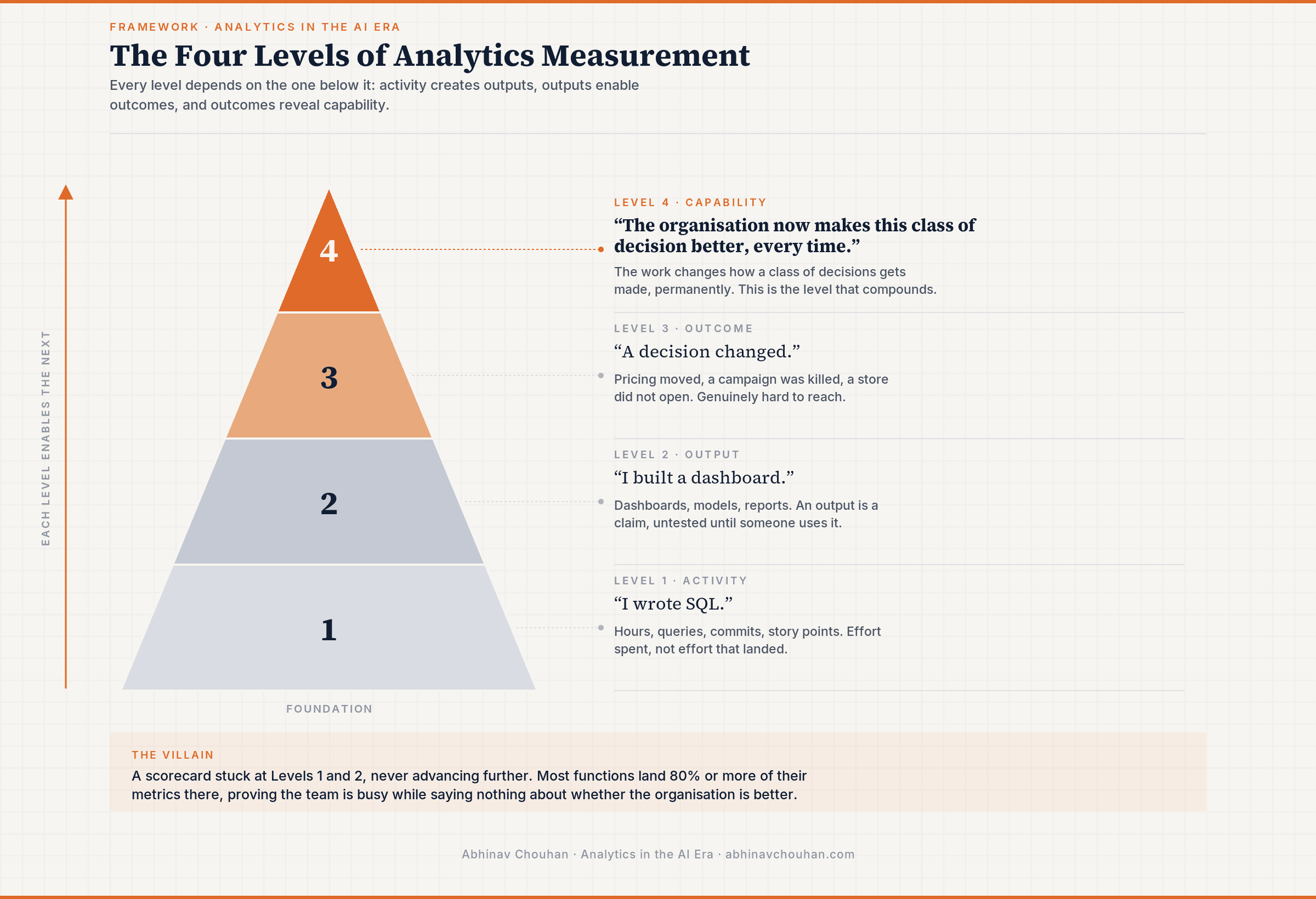
Level 1: Activity. Effort spent. Hours, queries, commits, story points. Activity metrics tell you the team showed up. They tell you nothing about whether showing up produced anything.
Level 2: Output. Things shipped. Dashboards, models, reports, closed tickets. Output metrics are where most analytics functions live, because outputs are countable and delivery feels like progress. But an output is a claim, and the claim is untested until someone uses it.
Level 3: Outcome. A decision changed because of the work. Pricing moved, a campaign was killed, a store did not open. This is the level most measurement advice tells you to reach, and reaching it is genuinely hard: it requires knowing what happened after delivery, which most teams never find out.
Level 4: Capability. The work changed how a class of decisions gets made, permanently. Capability is the work the organisation no longer needs from you, whether that improvement comes through people, technology, or both. A pricing experimentation platform that replaces an annual review, or a churn early-warning system marketing acts on weekly without commissioning an analysis: each is a machine for manufacturing Level 3 outcomes, which is why capability sits above outcome. A changed decision pays once. A changed decision process pays every time it recurs.
I would like to clarify one thing here because it is the most useful subtlety in the framework: classification depends entirely on what the work does. The same dashboard can sit at Level 2 or Level 4, and nothing about the artefact tells you which. One is built against the actual question pattern of a business domain and permanently absorbs demand; the other is a reflex deliverable, the eleventh variant of a question three dashboards already answered, and it usually adds to future demand by shipping one more conflicting number for the business to argue about.
Capability compounds. Productivity does not.
A productive team and a capable organisation can look identical in a quarterly review and be on opposite trajectories.
The productive team completes more requests every quarter, and receives more, because every delivered artefact trains the business to raise another ticket. Demand and supply grow together. The backlog is a treadmill with better cardio.
The capable organisation gets measurably easier to serve. Each significant piece of work reduces repeated demand, increases reuse of something trusted, or installs a decision process that improves on its own. The team may complete fewer requests this quarter than last. That is the metric improving.
Here is the sharpest test I know for telling the levels apart: what happens to this number when demand for the team's manual work falls? Activity and output metrics get worse, since fewer requests means fewer tickets closed. Capability metrics get better, because falling manual demand is precisely what capability looks like from the outside. Any KPI that punishes the organisation for needing you less is measuring the wrong thing.
What metrics look like at each level
The table below is illustrative. The examples matter less than the pattern; every row trades a count of work performed for a measure of what the work left behind.
| What gets measured today | Level | A stronger alternative | Level |
|---|---|---|---|
| Hours worked, SQL written, commits | Activity | Reuse ratio of governed data models | Capability |
| Hours saved by AI tooling | Activity | Decision latency, question to action | Capability |
| Dashboards delivered | Output | Repeat-question rate in the domains those dashboards cover | Capability |
| Requests completed, tickets closed | Output | Self-service deflection rate | Capability |
| Value of a single flagship analysis | Outcome | Share of decisions run through a standing capability | Capability |
I urge you to notice two things. The outcome row is not being demoted. Outcome metrics are worth keeping, and most teams haven't adopted them yet. The capability alternative simply asks a further question: does this outcome repeat without us? And the principle underneath every row is the same: measure the residue the work leaves behind, rather than the motion of producing it. Work happened either way. A Level 4 metric asks what remained after the work was done, and whether that remainder made the organisation permanently better at deciding.
The audit you can run this week
You do not need a transformation program. You need two honest conversations.
Start with the constraint. Ask your last three requesters what happened after delivery: "Yes the output was great, I looked at it a couple of times" signals a trust deficit. Ask the team where work queues before reaching them: requests arriving pre-shaped by someone two levels up signals an intake problem. One exception: if both answers point to short-staffing or broken tooling, that is a capacity problem, and no measurement framework will manufacture headcount. Fix that first.
Then run the audit itself.
- List every metric your function reported upward last quarter. Include the ones buried in the monthly deck. No formal metrics? Write down what leadership actually asks about; that is your de facto scorecard.
- Classify each one. Ask whether it counts effort, counts things shipped, moves only when a decision maker acts, or shows a class of decisions now getting made better, repeatedly, without fresh work from the team. Whichever question it answers yes to sets the level, one through four in that order.
- Tally the distribution. If the list is heavily weighted toward Levels 1 and 2, that skew says more about what the team has been asked to prove than about the team itself.
- Swap one metric. Retire one Level 1 or 2 metric, chosen by the constraint you found, and introduce one Level 4 metric in its place. Give it a fixed trial of one quarter, assign a named owner, and retire the old number the day the new one starts; a metric that runs alongside its predecessor always loses to the one leadership already knows how to read.
Keep some measurement at every level. You cannot run a team on capability metrics alone, and activity data still matters for capacity planning. The question is where the centre of gravity sits: a scorecard that is all Levels 1 and 2 can only ever prove the team was busy.
The goal of analytics is to leave the organisation permanently more capable of making decisions. The four levels simply make that visible.
The strongest analytics functions are the ones whose organisations become progressively easier to serve, because every significant piece of work leaves behind something permanent: a question that never needs asking again, a definition that ended an argument, a class of decisions the business now makes better every week without commissioning anything. Their delivery statistics may look ordinary. Busy is easy to prove. Better is the thing worth measuring.
If this was useful, Analytics in the AI Era goes deeper on questions like this every week. Analysis grounded in what is actually happening, applied to the work of leading data and analytics teams.
Subscribe here; free, and you can leave at any time.
If any of this connects to something you are working through, I would love to compare notes. Reach out.